
THE PROJECT
At the beginning, our goal was to design analytics dashboards that would be accessible and easy to read for users. However, as we progressed with the dashboard development, we soon realized that the project entailed much more than simply applying trendy styles in POWER BI.
THE CHALLENGE
The major issue stemmed from the metrics and analytics team's lack of knowledge in designing dashboards that were clear and accessible, resulting in confusion for readers. This highlighted two main challenges: firstly, the necessity to comprehend the program in which these dashboards were being created, POWER BI; and secondly, the need to develop a style guide and design system for the product. This would not only simplify and streamline the dashboard design process, but also ensure consistency across all dashboards.
MY ROLE
My work involved identifying key gaps in the interface, reviewing the scope of POWER BI customization, and determining the most effective methods to instruct developers on creating these components. To accomplish this, I created a comprehensive library of components and other elements, along with detailed documentation for their creation. Additionally, I took the lead in establishing a team of designers dedicated to streamlining the development of the brand's style guide and design system for the tool.
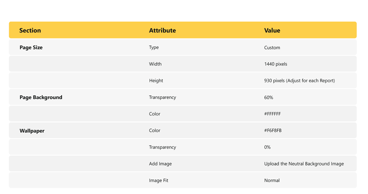
VISUAL STYLES
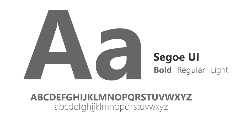
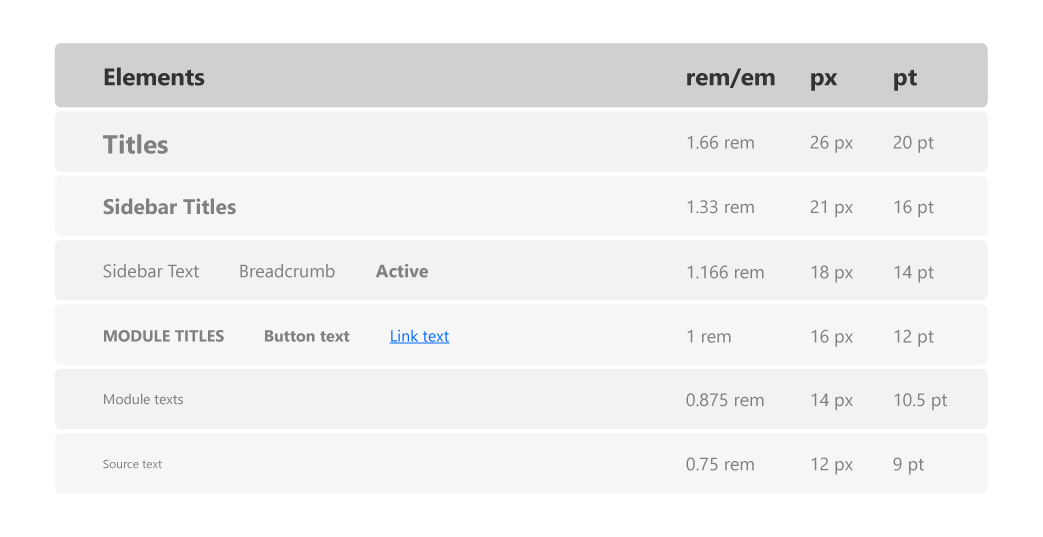
Typography
To facilitate users's experience, we choose the SegoeUI font family that is widely used in different Microsft applications like POWER BI. we stablished a typographic hierarchy in order to make the interface more readable and friendly. The following table is the one developers must follow in order to mantain design consistency.
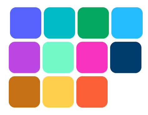
Main colors
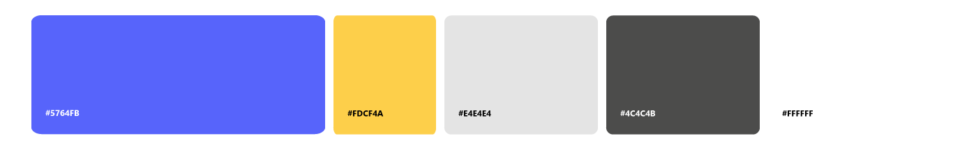
Interface colors that Will be used on sidebar menus, buttons, titles.
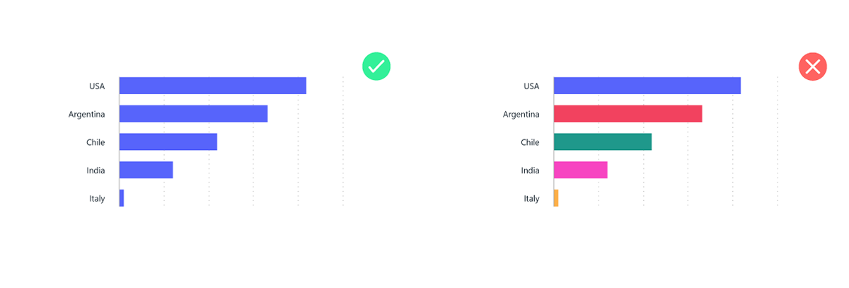
Categorical colors
Categorical colors are not ordered. Use these for categorical scales. Use categorical colors only in certain cases, Instead of giving each item a categorical color, encode them with a secondary dimension — ideally, one with few values. An exception is when the chart is paired with other charts that use color for the same categories.
Sequential color palettes
Sequential colors are ordered. Use these for ordinal and interval scales. It’s also acceptable to use these for ratio scales. Darker colors show larger numbers, dark colors can often carry a subconscious association with density. Transitions go from light to dark as the numbers get larger.
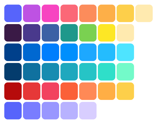
These are examples of the color palettes we designed for various purposes, including diverging color palettes, alerts color palettes, text usage in colors for graphics and gradient usage in certain components. These palettes were carefully crafted to ensure visual harmony and effective communication within the interface.
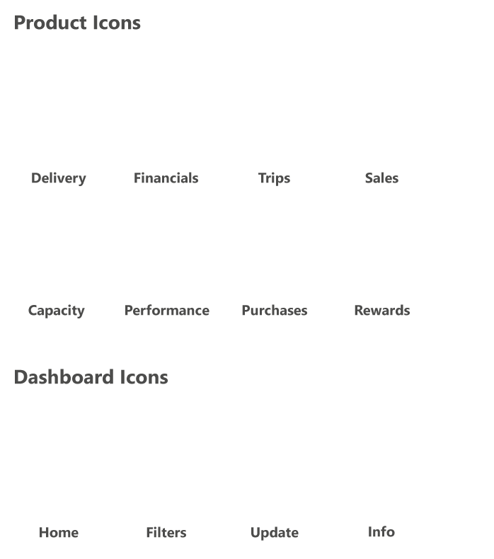
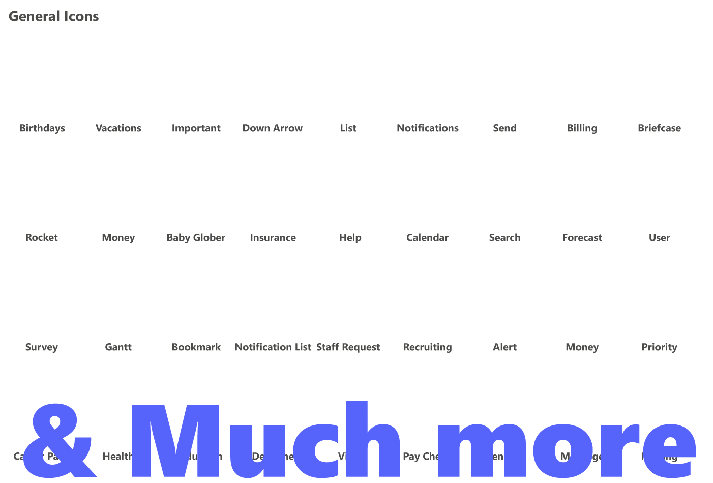
Icons
Sizes
Icon sets
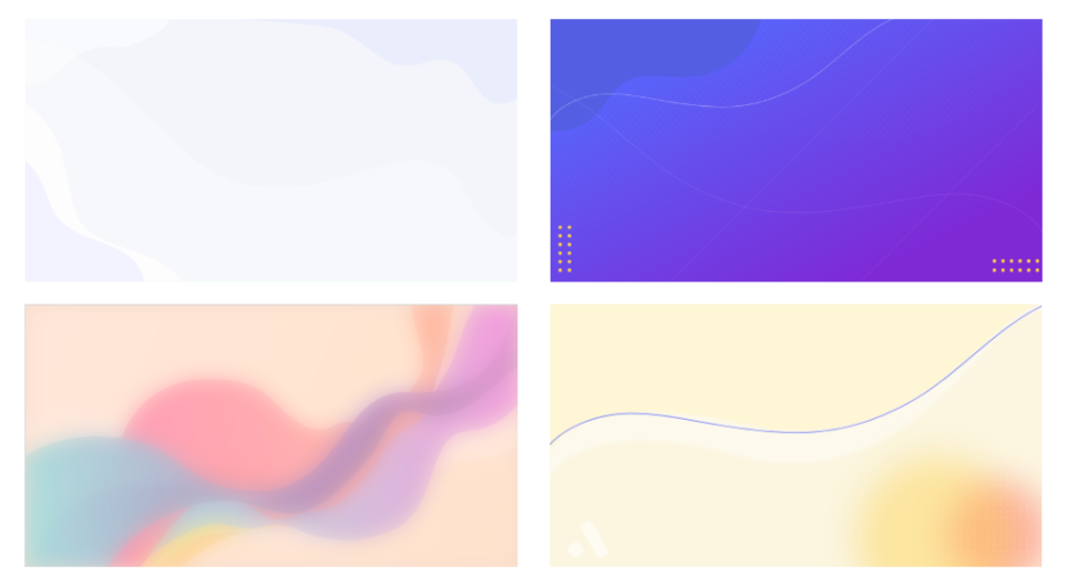
Backgrounds
The backgrounds were designed to update the boards and not be so flat, for these we made an implementation guide for POWER BI so that developers could implement them without affecting the visual style.
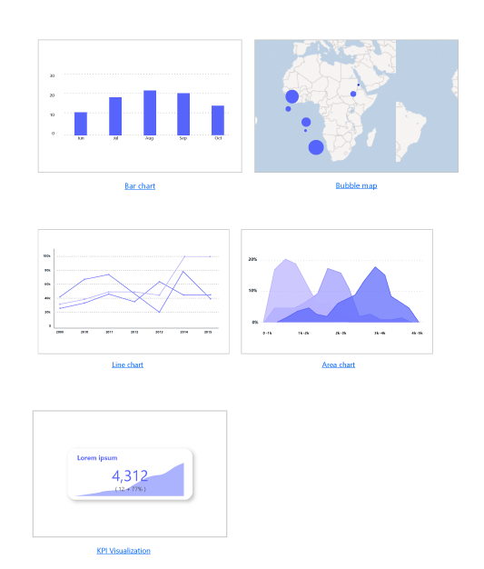
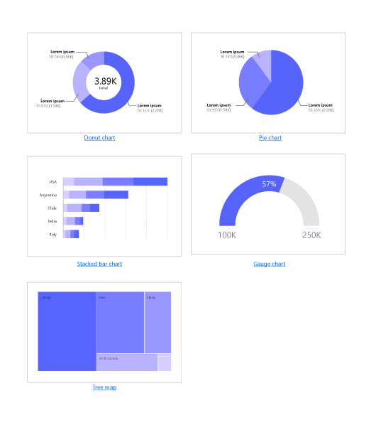
Data visualization
Data representation can be as simple or as complex task, depending on the approach or the way you handle it, we started by identifying the purpose of the visualization and then choose the appropriate chart type.
Charts types
Charts anatomy
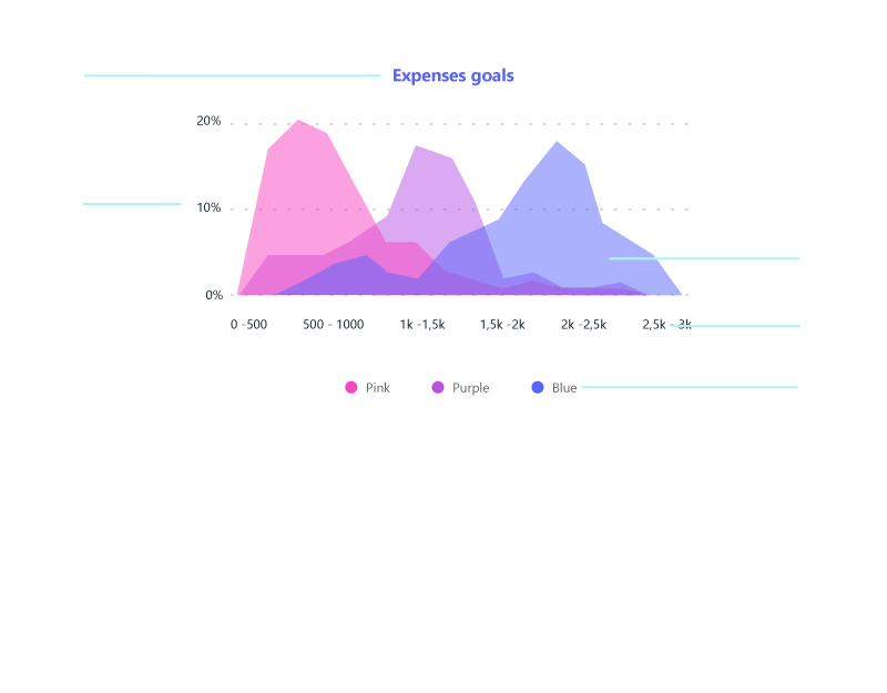
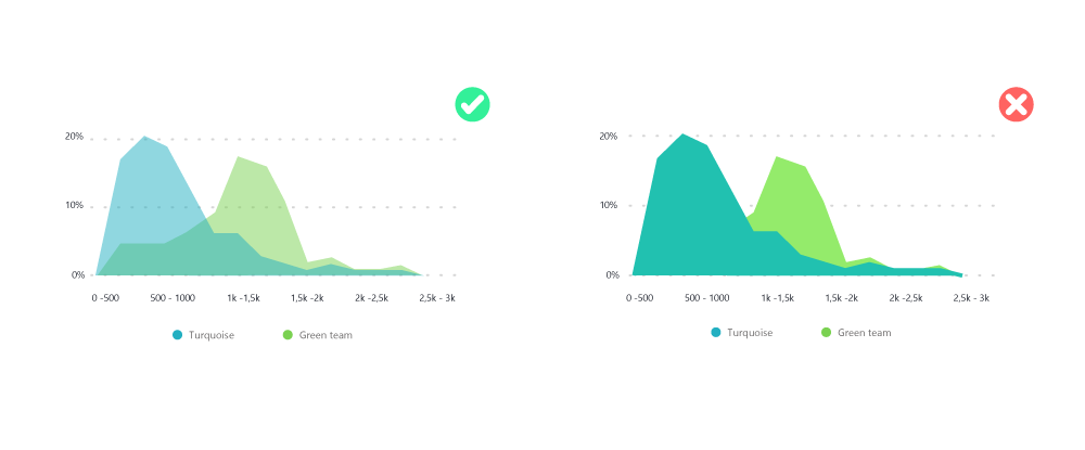
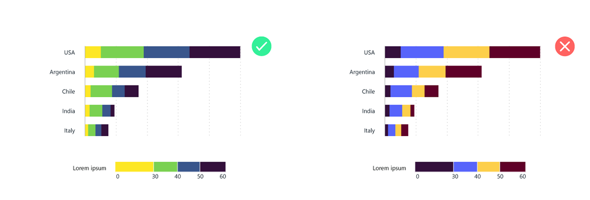
Color usage
Some examples for Harmonic color in area charts.

These specifications were done for all the
charts and graph that POWER BI have to use.
UI COMPONENTS
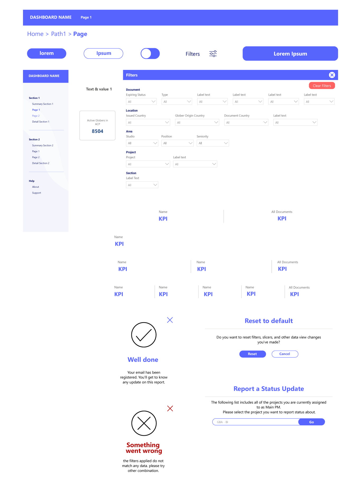
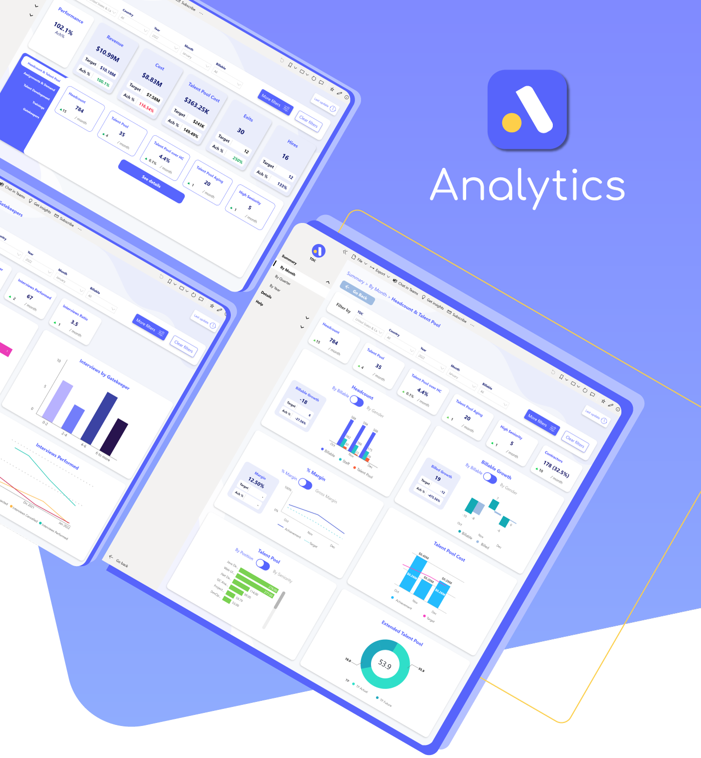
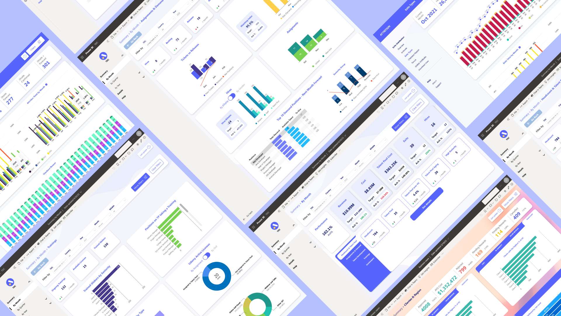
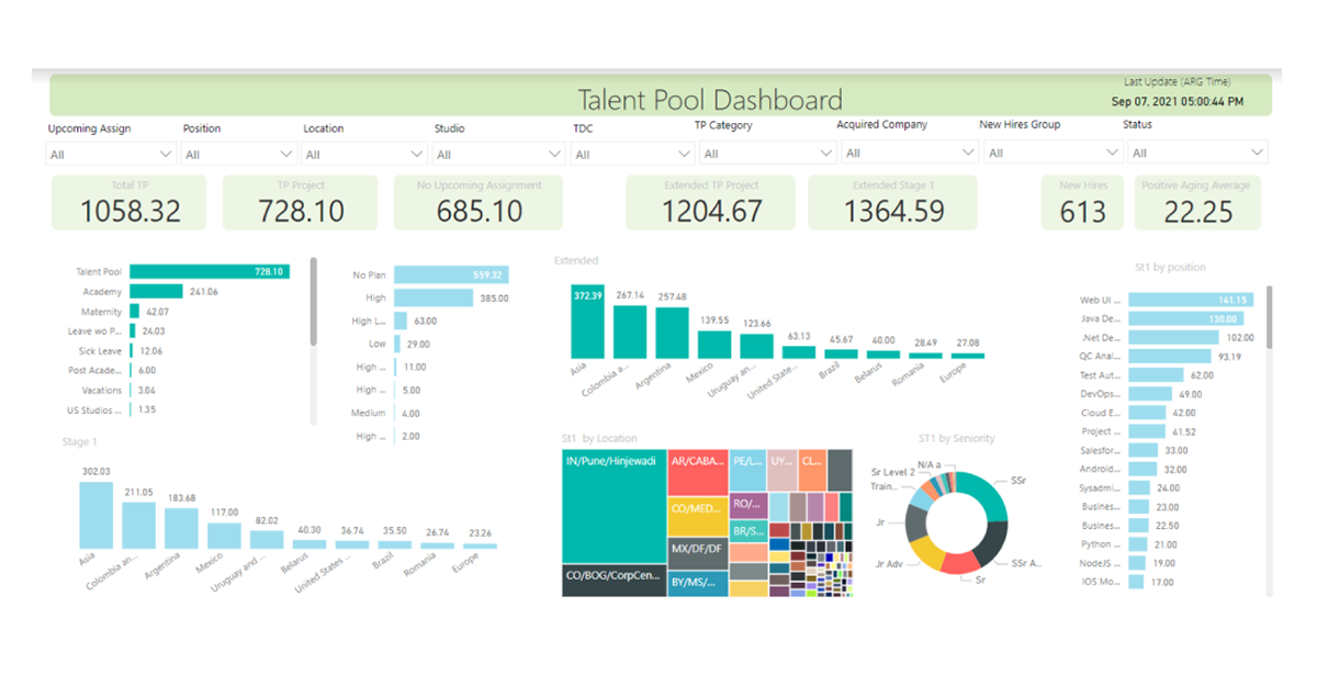
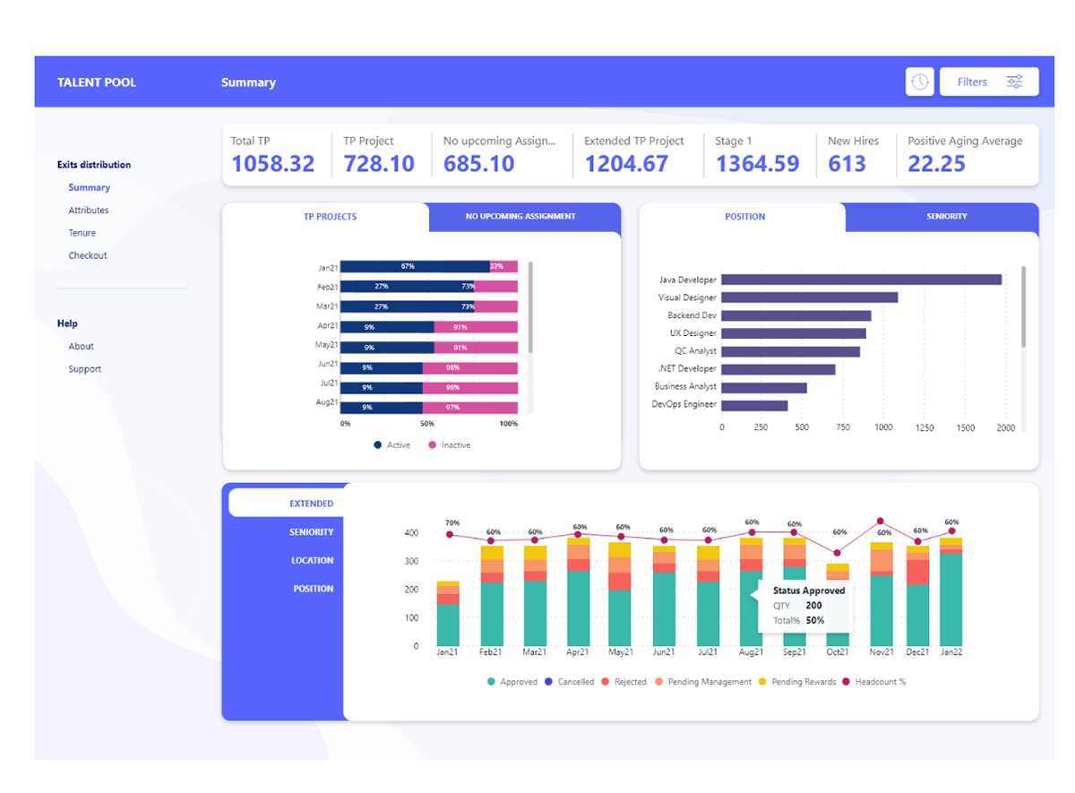
DASHBOARDS SCREENS
WHAT WE DELIVERED
We provided the analytics team with a comprehensive UI style guide, enabling them to create visually appealing and easily readable dashboards. This guide significantly streamlined the dashboard design process, resulting in a tidy and consistent appearance across the entire Analytics team. It optimized design time and ensured a cohesive visual experience for users.
OUTCOMES
- Optimized the delivery times.
- Standardize the UI elements and components for Analitycs team.
- Understand how POWER BI works when creating and designing dashboards with customized styles.